Vsaiul Isulloins
The aim of this page is to provide visual and optical illusions which I think are not the sort that are seen in 101 books etc on illusions. They fall in four categories, which are, in order of preference:
- New illusions: good illusions which explore a new or unusual psychological effect.
- Hard to explain illusions: illusions where I find it difficult to understand how they work.
- Novel presentations: old illusions presented in a novel and artistic way which somehow heightens the effects of the illusion.
- New explorations: old (or new) illusions set in a way that enables a better explanation of the illusory effect.
The right to copy or distribute any of the illusions on this site is at the sole discretion of the relevant copyright owner. Illusions are included with permission.
Okay. I admit. It is years since I added to this page, but I bumped into these doing the rounds (I have tried to find out, but don't know the rights holder for these - if you know who I should attribute these to/request permission from, then do let me know). It is a golden oldie illusion, but done very well. I have to thank my son for drawing my attention to them.
Previous illusions of the month
This month is another old favourite type of illusion. A great use of YouTube: Its... the... Colour Changing Card Trick.
Unfortunately not everyone will see the following illusions, as not everyone is red/blue depth illusion sensitive. Furthermore for those who are, the majority will see the red in front of the blue, but a few will see it the other way round. Depth illusions like this are very peculiar. Despite the fact that the surface is entirely flat, we perceive a stereo visual affect. Furthermore if you shut one eye the effect goes away! This is despite the fact that your stereo vision should actually be giving you information counter to your perception.
This month we publicise the work of Elin Bjorsvik, which I first saw in an exhibition at the C venue of the Edinburgh Fringe Festival. Most of this work is acrylic on canvas. Needless to say the image renditions here fail to do justice to the original works, but they do get a feel across. Here I focus on those of her works that are red/blue illusions, but there are many more to see on the website.
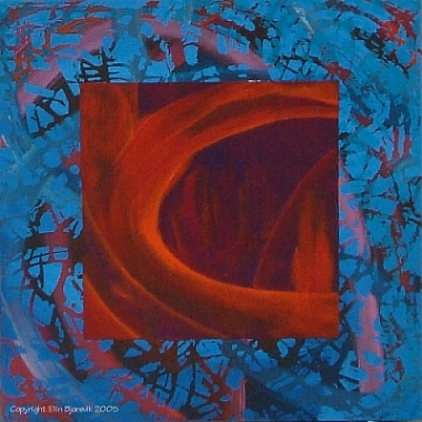
Evident Scenery
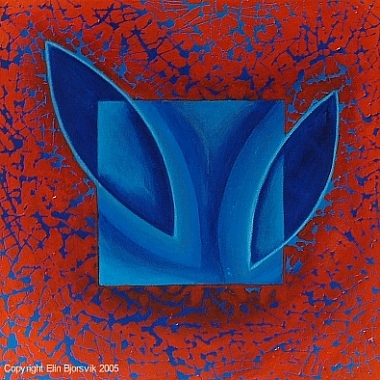
Abstraction in Red and Blue
All works are included with permission, and, of course, Elin holds all copyright of these works. Many of the original paintings are available for sale on her website.
This months illusion was brought to my attention by Walt Anthony, and the example given here is his. It is an interesting and enlightening illustration of the colour aftereffect illusion. Stare at the nose in the negative image below for at leat 1 minute, preferably longer. Then move your cursor over the image, and it will change. Keep staring at the same spot. I don't really need to say anything else really.
To make your own, why not follow Walt's own guidlines.
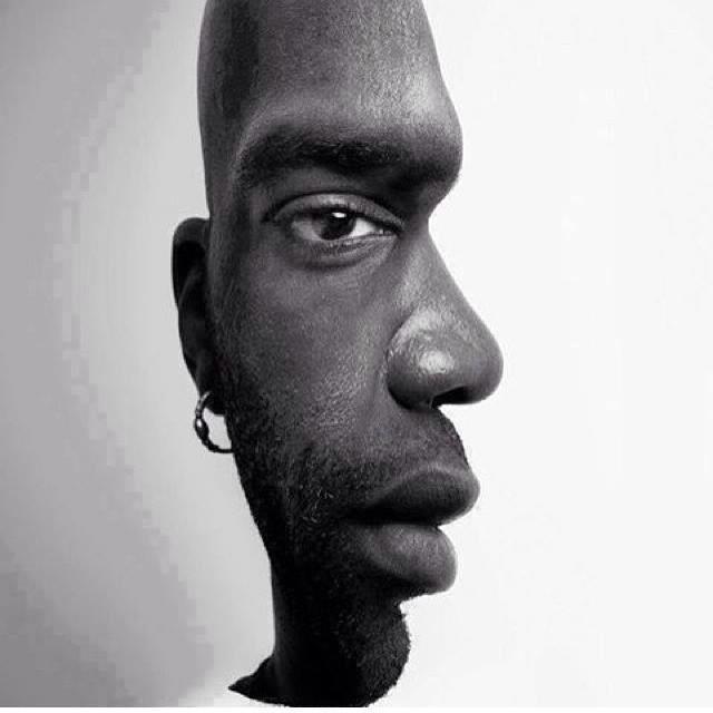
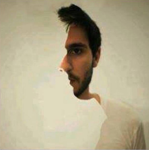
 This month you have to build your own illusion. This is the old face convexity back again (click pick for a movie), but this time Binary Arts have provided a cutout model to do all the fun with. Just follow the instructions on the Grand Illusions website. Oh and thanks to Lyndsey Pickup for drawing my attention to this one.
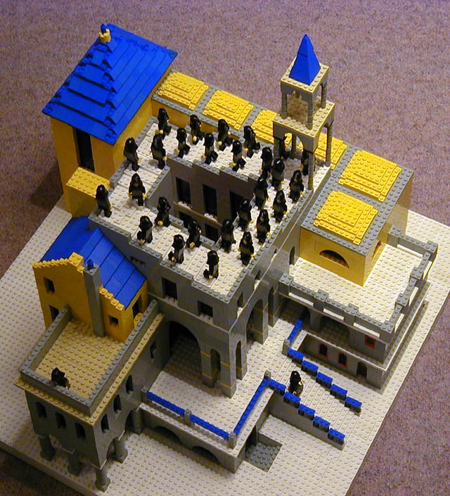 It is about time I split this page up as it really is getting a bit long. However I am afraid I don't have time for that just at the moment, so sorry if the page takes a little long to load. Let's get on with the business: this month is fun. I liked this too much not to include it. Andrew Lipson has a great site, including a fun front page. Of particular relevance to us though, is a bit of work he has been doing in everyone's favourite building material. There is a lot more to be seen but I'd just like to show one piece here. It is Andrew's version of Escher's "Ascending and Descending". Click for a larger version. This was joint work with Daniel Shiu. The full details regarding the construction can be found at Andrew's Lego Escher site. I'll keep you posted. Again, please note that these images are copyright Andrew Lipson, all rights reserved, included with permission.
It is about time I explained the title to this page. Recently I received an email circular which caught my attention. Many of you will also have seen it. It read
Aoccdrnig to rscheearch at Havrard uinervtisy, it deosn't mttaer in waht oredr the ltteers in a wrod are, the olny iprmoetnt tihng is taht the frist and lsat ltteer is in the rghit pclae. The rset can be a toatl mses and you can sitll raed it wouthit a porbelm. Tihs is bcuseae we do not raed ervey lteter by itslef but the wrod as a wlohe. Initsereg!!
I thought this was a fun email as it attempted to prove its point by the very process of reading it! I found that, so long as I did not concentrate on the words, I could read the sentence as fast as I could have read it without the letters being jumbled up. Of course there are many cues, and one could argue that some cheating has been going on. For example maintaining the phonetic end of words ('ng' 'ch', and 'st') does help, but it is not necessary. I tried with a host of different sentences, trying hard to mess things up, and in general things were readable. Longer words naturally became harder to decipher and understandably context was quite helpful. It is certainly not as simple as the email makes out, but it is a good first approximation.
I also did a little research on the history of the email, and found something quite interesting. When the email first started out, it began with the words 'According to research at Cambridge University', with the letters suitably jumbled. At some point in its history, this was changed. A classic example of Scientific Imperialism :). In fact it is likely the phrase related to nothing at either University!
Those interested in following up this effect might be interested in looking at research into the way the two hemispheres process word data, and work on eye movements during reading. Often the eye focusses centre word, and each half of the word is processed by different halves of the brain, with the information from each part eventually being combined. However eye movements are a little more complicated than this when reading sentences...
The following demonstration, by Daniel White, is a great use of the colour aftereffect illusion. The image below (click for a larger, more effective version) will give an example of a colour you will never see on your computer screen. Stare at the dot in the centre of the red circle for three to five minutes. You will see the edges of the circle begin to glow, but do not stop staring at that point - keep on. After a few minutes move your head back and you will see a glowing ring around the red circle. The colour you are seeing is a cyan which will be perceptually totally different from any of the colours you have seen on your computer. The colour gradient to the right shows the shades of 'cyan' which your computer can produce, none of which match the colour you see with this effect.
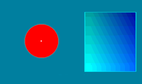
(c) Daniel White, included with permission.
There are two contributions to this illusion. First note that the colour aftereffect perceptually subtracts the red you have been staring at from the colour (computer cyan) you are now looking at. The basic point is that computer cyan is very distinct from true cyan. The first reason for this is that both CRT and LCD monitors produce colour bleed. This means there is a significant amount of red in the cyan produced by the computer monitor. To see this fill the screen with cyan (or better still put a cyan line on the screen) in a dark room, and use a CD surface to produce a diffraction pattern from the light. You will see a red line which is produced by the diffraction pattern. This is the red coming from the screen.
The other effect is more subtle, and is to do with the limitations of tricolour coding. The eye has 3 cones which detect colour. However the response curves for the three cones overlap significantly. This is what allows the eye to distinguish a variety of colours. True cyan does in fact produce a significant response in the eye's 'red' cone (say about 10% of maximum absorbtion). However by mixing green and blue it is not possible to produce even that little 'red' response due to the nonlinearities of the response curves. For green-blue cyan the red cone is at about 20-25% of maximum absorbtion (the numbers are guessed from the graph, so don't quote me on it). Hence the colour we perceive is equivalent to a true cyan plus a bit of red. In fact true cyan is one of the hardest colours to represent in tricolour coding. For more information see this lecture on colour image processing, especially figure 3, the C.I.E Chromaticity Diagram. It is clear from this figure that cyan lies on the 'edge' of the CIE region which has the highest curvature. The colours representable with a tricolour coding scheme are those which lie in the interior of the triangle with vertices at the three colours. The curvature of edge of the CIE region means it is a hard to pick values for R, G and B to contain cyan in the RGB triangle. It also shows the the computer is necessarily fundamentally anaemic at producing the true variety of greens the eye can detect.
Daniel White has many other interesting illusions and items on www.skytopia.com. His site is well worth a visit.
The work of Akiyoshi Kitaoka provides some exemplary illustrations of visual illusions. He goes to some lengths to attempt to create as heightened an illusory effect as his can. There are many anomalous motion illusions about, but I believe that some of the ones Akiyoshi has generated are some of the most effective I have seen. Here is my current favourite. Click to get a larger, more overwhelming version.
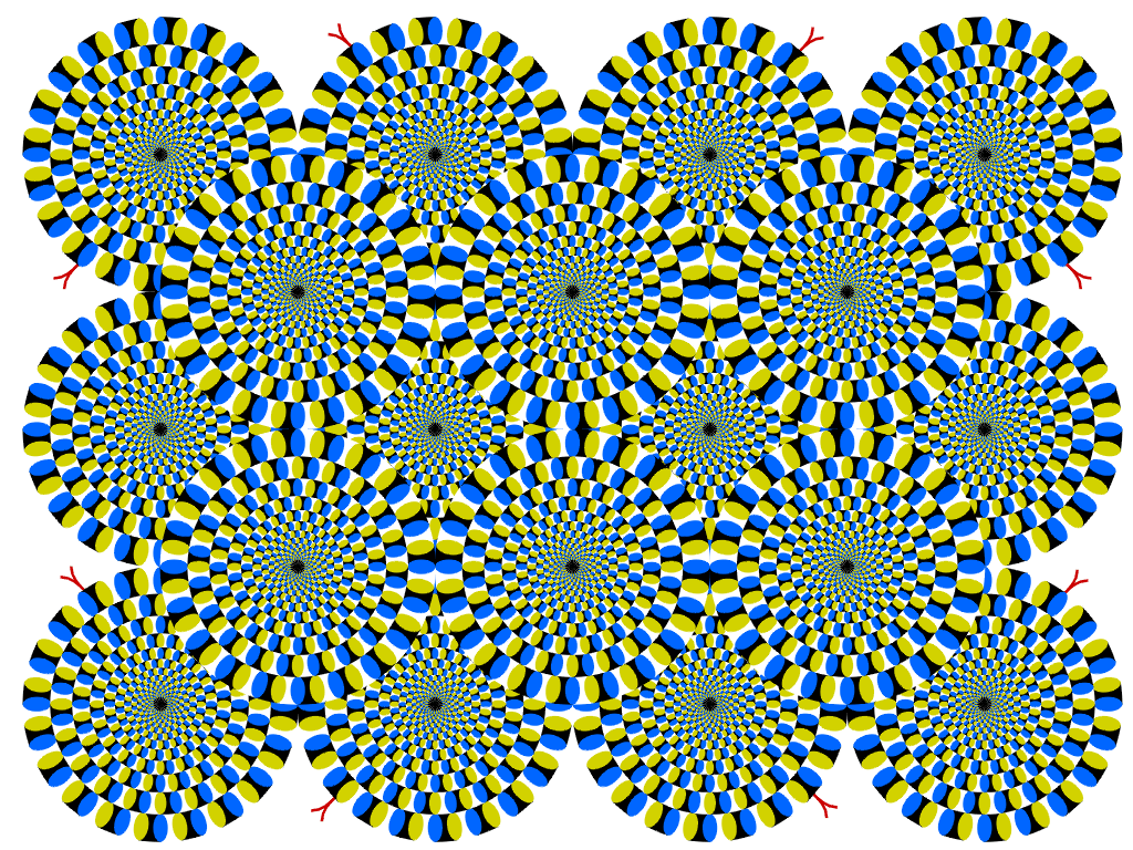
(c) Akiyoshi Kitaoka, included with permission.
There have been a number of analyses of the motion illusion. The most obvious interpretation would seem to be in terms of what computer vision scientists call optic flow. The paper The Ouchi Illusion as an Artifact of Biased Flow Estimation takes that line of analysis.
By the way I have also added an addition to an earlier Kitaoka illusion on this page - the bulge illusion now accompanies the curved checkerboard.
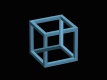
 This month's illusion is an interesting composition along an old favourite theme. The fact that it takes things into three dimensions, and produces the ghostly cube effect using only shading changes which do do not disrupt the underlying structure of the blocks in the composition are what I think gives it the edge. This work is copyright of Michel Bellot and is included with his permission. A larger copy of the illusion can be found at Illusion: Cube 2, and more of Michel Bellot's work can be found at FIgURES FiCTiVeS.
I am afraid I haven't been able to come up with that good an illusion this month. However this occasionally fools a few people.
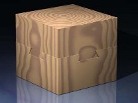
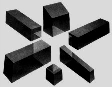
A craftsman took two solid pieces of wood, and carved them so they could be put together in the form illustated below (the slight overhang is only used to illustrate the two parts). Each part is solid, and cannot be seperated. The whole block is solid and has no spaces inside. The full cube could be lifted by picking up the top half.
How was this cube created (no adhesive used)?
 The following image was found on a junk mail circular offering
"significant gains" in your stock market
investments (yeah, right, sure). The associated image
seemed to promise an infinite supply of money!
It is effectively a (less aesthetic) version of
the Escher "ever
ascending staircase" that I haven't seen before.
The following image was found on a junk mail circular offering
"significant gains" in your stock market
investments (yeah, right, sure). The associated image
seemed to promise an infinite supply of money!
It is effectively a (less aesthetic) version of
the Escher "ever
ascending staircase" that I haven't seen before.
I was trying to get a copy of the optical pool illusion from the Plum Temple in Zhaoqing for this months illusion. Unfortunately I failed. However I did come across one of Jerry Andrus' many inventions which I thought should feature here as a 'real' version of an earlier illusion.
The left image is the illusion, the right is how he did it. Interestingly the same effect is achieved by a different means than the rotating version I put here earlier.
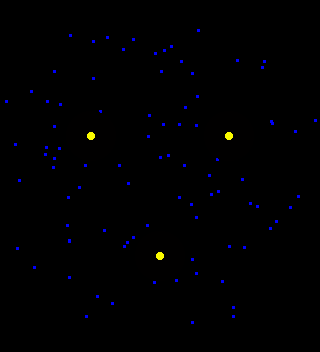
Look at the centre of the three yellow dots and take in the motion of the blue ones. Eventually the yellow dots will disappear for a short while. If the rotation is going too slowly, clicking on the image might help.
This is a motion induced blindness illusion, from Bonneh, Cooperman and Sagi's nature paper (411:798-801).
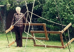
 This month we have more of the same. The link on last month's optical illusion showed how even the temporal cues of rotation could not overcome the convexity assumptions for a face. This month shows how temporal cues are generally pretty poor anyway. Here a real object is rotated into an illusory position, and yet still the brain will not keep track of the real object and sees the peculiar illusory object. For a larger (approx 1MB) avi of this click here. This illusion was found on Natis' site.
Oh and here is a real example of last months illusion, also taken from the same site.
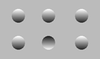 So this image consists of 5 circular bumps pointing out and one circular depression, right? But if you work it out the shading of the bumps could equally imply the opposite: 5 concave bumps and one convex one. The brain assumes that light comes from above. In Bayesian speak, the prior distribution on light source position is used to infer the convexity. Flip the image the other way up, and the bumps invert. There is now one convex bump.
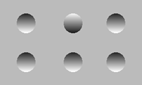
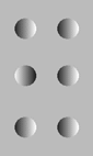
So what happens if the image is rotated through 90 degrees. Here is an animated example. How this is seen varies across people: for some the perception flips back and forth, where convexity is assumed for the largest number. For others they stick with one perception, with only a single bump flipping at each time. Others see it all as convex objects with peculiar things happening to the lighting locally. One common experience is to view whatever button you are focussed on as convex and others in relation to that shading. Interestingly in this situation, when that button flips, it is viewed as all the rest of the buttons flipping instead. In general, though, the brain seems to have a higher prior probability for convex objects than for concave ones (in Bayes speak). Most people can get a number of these perceptions by varying where they are looking.
The most impressive example of the brain's convexity preference comes from the classic inverted mask illusion. A good example of this can be seen at this site (requires fair bandwidth and a quicktime plugin).
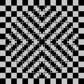
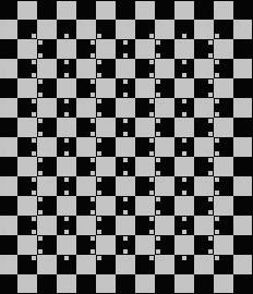
This month we try a line-based illusion. These might seem less impressive, but this is probably simply because we've seen them many times before. Even so I think these two illustrations show off the effect to a degree beyond what we are used to. Of course you don't need me to tell you that the lines are straight. These illusions are two of the many great works of Akiyoshi Kitaoka, and he holds the copyright. Included with permission.
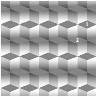 See the following image? Look at regions 1 and 2.
The two diamonds are of equal brightness. (Thanks to David Mackay for bringing this illusion to my attention - I think it is one of the best). If you are not convinced then try printing the image out, cutting out one diamond and overlaying it on the other. The more digitally minded could just test the pixel values in the image. This is the Logvinenko illusion, and is the strongest lightness illusion in its class. For an analysis of lightness illusions see this article by Fred Kingdom.
See the following image? Look at regions 1 and 2.
The two diamonds are of equal brightness. (Thanks to David Mackay for bringing this illusion to my attention - I think it is one of the best). If you are not convinced then try printing the image out, cutting out one diamond and overlaying it on the other. The more digitally minded could just test the pixel values in the image. This is the Logvinenko illusion, and is the strongest lightness illusion in its class. For an analysis of lightness illusions see this article by Fred Kingdom.
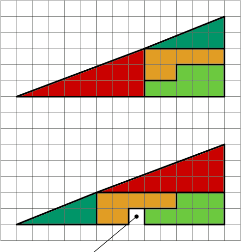
Each of the four partitions in the lower picture are exactly the same shape as those used in the upper picture. So where does the hole come from?